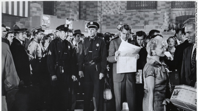
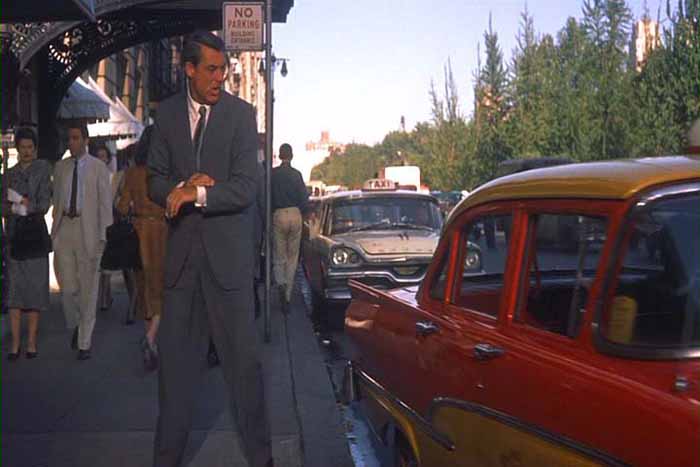
Cary Grant's suit design

"The brute covers himself, the rich man and the fop adorn themselves, the elegant man dresses!"

-Honore de Balzac

Minh
Posts: 71
Joined: Sat Apr 09, 2005 8:43 am
Contact:

Sat Aug 10, 2013 12:09 am

How did Cary Grant design a suit to look like this?

Image

There are many ways of dressing beautifully. But even if our tastes differ from his, it's worthwhile to think about why he made certain design choices. Edith Head, who won the Academy Award for costume design eight times, commented that Grant has "a discerning eye, a meticulous sense of detail. He has the greatest fashion sense of any actor I've ever worked with." Grant himself said that "it takes 500 small details to add up to one favorable impression." Why did he choose the details that he did?

I would say, looking at the photo, that his design principle was to ensure that the jacket flowed smoothly into the trousers, to unify the whole suit into a single unbroken line. What's extraordinary is that we can barely tell where the jacket ends and the trousers begin. The eye sweeps from top to bottom in an elegant impression of height and grace.

It sounds easy, as easy as making sure that the jacket fabric matches the trousers, but in reality it's overwhelmingly difficult. There are many places to stop the eye, to break the line from shoulder to shoe. So how did he do it?

The main point of difficulty in a suit is where the wider jacket meets the narrower trouser. The difference in scale can break up the suit into two visual parts. The eye stops at the jacket bottom and the body is divided into half, as in Hilfiger's suit:

Image

Grant's secret was to make the jacket bottom trimmer at the same time that he made the trouser tops wider. It was an ingenious move: usually wider trousers are paired with an excessively large jacket, as in the 1980s. If the jacket is slim, then the trousers are too tight, as is the trend today. Either way, a horizontal gap remains where the jacket and trousers meet:

The 1980s:
Image

Today:
Image

Grant's masterstroke was to cut the bottom of the jacket close to the thigh, while the top of the trousers were fuller and pleated. The result was to preserve to smooth flow between the two halves of the suit. This explains what would otherwise be puzzling decisions on Grant's part. Why did he choose pleated pants when the Ivy League look at the time preferred flat-front? It was to scale up the top of the trousers, so there would be no horizontal gap with the jacket. Why did he select a ventless jacket? It was to make it possible to cut the jacket bottom closer to the thigh without having any vents swinging open. Why was the jacket darted when in the late 1950s most American jackets were undarted? It was to taper the jacket down to meet the trousers.

Image

Despite the jacket being tapered, it was nothing like the slim jackets of today with their low-rise pants. Many contemporary designers break up the suit by making the jacket too short and the trousers too low. This opens up a distracting vertical gap, showing the dress shirt between the jacket's fastening button and the waistband:
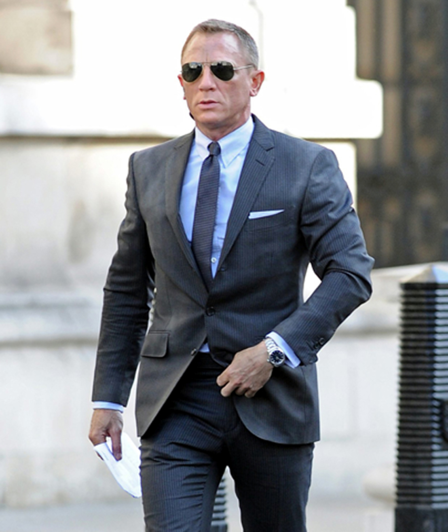
Image

Grant closed this vertical gap, preserving the smooth line of his suit. He brought up the trouser waist with a higher-rise, while lengthening the jacket. There's no glimpse of dress shirt to stop the eye:

Image

The length of the suit is more flattering than today's short jackets, as worn by Craig and Browne. These modern jackets make the eye dwell on the top of the body, as if we were looking at a windbreaker. Grant's longer jacket leads the eye up and down the entire silhouette of the suit.

When Grant united the jacket and trousers, he tapered the whole suit from moderately built up shoulders down to a trim leg opening. The profile is a trapezoid, and the effect is masculine:

Image

Image

Image

The trapezoid shape was one of Grant's design breakthroughs. Since the suit tapered, it prevents the jacket from looking boxy, or the trousers from looking like Oxford bags. He further streamlines the silhouette by replacing a bulky belt (like Hilfiger's above) with side adjusters, and pocket flaps with jetted pockets.

The trapezoid shape is quite distinct, as it differs from today's common hourglass shape. The hourglass suppresses the waist to bring attention to a slender torso and strong shoulders:

Image

Done well, it can look sophisticated and attractive. Why didn't Grant suppress the waist more? He wanted to preserve the trapezoid shape. If the waist were suppressed more, the jacket would have to flare out in the bottom half (the skirt) to cover the hips. The line of the flared out jacket would not have met the line of the trouser. A suppressed waist also tends to draw attention to the narrow part of the jacket, instead of letting the eye move up and down the whole suit

The trapezoid shape could have gone awry if the shoulders were too broad, as in Richard Gere's 1980s suit. Grant prevented that from happening by having a shoulder that is built up, but moderately so. It's not cut too wide or too straight.

Moderation was a central design principle for Grant. Moderation helps unify the suit by making sure that the eye does not stop on any one element. That is why Grant choose labels that were three and half inches wide, and not five or two. That is why Grant selected a natural sleevehead, and not a roped one. That is why he matched his color of his tie with his suit. He wanted the eye to sweep over the whole suit without dwelling on any one part.

Not too bad for suits that many people call "boring."
Last edited by Minh on Tue Feb 25, 2014 7:42 am, edited 1 time in total.
dempsy444
Posts: 132
Joined: Sun Mar 27, 2011 5:32 pm
Contact:

Sat Aug 10, 2013 2:32 am

You aren't giving Grant too much credit and his tailor too little? I'm sure he was a very sophisticated customer but....
couch
Posts: 1291
Joined: Tue Jul 19, 2005 12:47 am
Contact:

Sat Aug 10, 2013 4:19 am

Grant would have learned the lesson of matching the circumference of jacket skirt to the fullness of 'cone' shaped trousers in the mid- to late 1930s. This principle was widely observed and hardly original with him, as you can see from any number of threads on the LL including Etutee's copious reproductions of AA illustrations. In the period beginning then--among his most elegant--his jackets were more waisted, many had vents, and many had roping:

Image
Image

He had learned to have extended shoulders cut to balance his large head, which also accentuated the male V you cite (Grant was not naturally broad-shouldered, as any number of scenes and photos in bathing or shower attire attest):

Image

Alden has pointed out many times this particular virtue of trousers that are relatively full at the seat and taper to the hem, as a search on "trouser line" and "trouser cone" will show--that they unify the line with the jacket. The traditional Savile Row practice of cutting a slightly cupped skirt also assists this effect, especially when vents are present.

By the 1950s, when your photos were taken, Grant's concession to prevailing fashion was a less fully draped jacket and trimmer trousers; ventless SB jackets were more common in the late '40s and '50s and indeed helped to control the silhouette as you suggest. The unroped "natural" shoulder reflected a more assertively "American" and less anglophile mood in U.S. menswear than in the prewar years, and indeed made Grant's extended shoulders a bit less obvious. I think you're completely correct that by this time he had perfected his sense of balance and proportion, so that his version of a 1950s suit exemplified a restraint and unity of impression superior to most of his peers. But it's possible to observe jacket skirt circumference well-matched to trouser fullness on any number of other men from the mid- to late '30s on. I agree it's a principle that could profitably be revived today.
Minh
Posts: 71
Joined: Sat Apr 09, 2005 8:43 am
Contact:

Sat Aug 10, 2013 7:43 am

That's a good point about the influence of the 1930s on Grant. I love the late 1950s suits, but the 30s have a powerful attraction to me as well. I would agree that Grant did not originate all of the ideas I mentioned. Every creative person is influenced by other artists, the spirit of the present, and the inheritance of the past. I believe what's distinct about Grant is how he brought all of those influences together into a unique creation, infused with his own ideas, in collaboration with the great skills and artistry of the tailors. (1)

While I admire other ways of dressing that are very different from Grant's (just as I enjoy more than one style of music), I wanted to discover what was the thinking behind his design choices. I wanted to enter his perspective and try to see why he made certain decisions, the way we might consider why a poet used a particular meter or sequence of words. It's a sympathetic understanding, though not always one of agreement, that leads to a more profound appreciation of art and inspiration of our own.

(1) At the time, the tailor for Grant in Indiscreet and North by Northwest was Quintino of Beverley Hills on Wilshire Boulevard, as Martin Landau, Grant's fellow actor in North by Northwest, reveals: http://www.telegraph.co.uk/culture/film ... s-gay.html. Anyone with more information on the tailor and the firm would be most welcome. Quintino was officially credited in Indiscreet.
Last edited by Minh on Sat Aug 10, 2013 11:50 am, edited 1 time in total.
Julian
Posts: 58
Joined: Sun Sep 25, 2011 10:25 am
Contact:

Sat Aug 10, 2013 9:40 am

What a fascinating post.

One thing that I notice about his suits, something that is most clearly shown in the fifth photograph (the one just before the Daniel Craig photograph in which he's flanked by two policemen), is what is in my opinion a perfect cutaway line for the front of the jacket below the bottom button. I am personally wrestling with this to get it right as I continue my bespoke journey (three single-breasted two-button sports jackets commissioned so far). I personally feel that having the front too closed can make the front balance look overly heavy at the bottom and have a fattening effect on the wearer even, or maybe especially, for someone slim such as Cary Grant or myself. How much do people feel that this contributes to what I agree are the very elegant lines on these suits?

- Julian
couch
Posts: 1291
Joined: Tue Jul 19, 2005 12:47 am
Contact:

Sat Aug 10, 2013 12:05 pm

It looks to me as if the jacket in that picture is a 3-roll-2. I agree that the shape of the quarters balances the lapel line nicely. I think your point that more closed quarters appear bottom heavy is more salient on a true two-button jacket. In that case, with a longer, more open lapel V and more exposed shirt/tie, closed quarters indeed give more visual weight to the bottom of the jacket around the waist and hips. Jacket length also comes into play. Consider that most DB jackets, which are cut square across the bottom, don't look bottom heavy because they are closed farther up the chest, exposing less shirt, and are usually cut slightly shorter than SB jackets. Also, to Minh's point, they are also usually ventless so the quarters tend not to open with movement. But too-open quarters on a SB jacket can also make one look plump by appearing to be pulling away from a protruding middle.

I prefer a slightly more waisted cut than Grant's '50s suits, and a slightly shorter jacket (but nothing like the bum freezers of the '20s or today's Hedi Slimane-influenced styles). You have to be very careful with length on a such a boxy cut or it can end up looking droopy, as the figure in the light-colored suit to the right of Grant in Minh's seventh photo illustrates.
rodes
Posts: 426
Joined: Wed Aug 25, 2010 4:28 pm
Contact:

Sat Aug 10, 2013 4:31 pm

Cary Grant always looked good, even in buckskins. After all that was his job. However, to my eye he looked his very best in the double breasted suits that he favored in earlier films. These suits presented his tall, slender form to best advantage.
Mark Seitelman
Posts: 965
Joined: Fri Feb 11, 2005 8:42 am
Location: New York City
Contact:

Wed Aug 14, 2013 1:56 pm

Cary Grant looked terrific because his suits were full and well proportioned.

Grant's suits were classic in their proportions. It also did not hurt that he was Cary Grant.

Unfortunately, the young Turks of design have deemed the classic suit to be old hat, therefore, they have come-up with new proportions and a tighter fit, such as a too short coat, low rise trousers, and tight-as-jeans trousers.

Without taking credit away from Grant, almost every Hollywood star looked terrific from the golden era. They wore well proportioned suits made by either the wardrobe departments or a few private tailors in Beverly Hills and Hollywood (e.g., Schmidt & Gallupo for Adolphe Menjou and Quintino for Grant).
theoldesouth
Posts: 152
Joined: Tue Jul 23, 2013 8:09 pm
Contact:

Wed Aug 14, 2013 6:08 pm

Minh, thank you for starting this interesting discussion.
Minh
Posts: 71
Joined: Sat Apr 09, 2005 8:43 am
Contact:

Tue Aug 20, 2013 10:26 pm

I appreciate everyone's thoughtful responses. I think Julian is right that the open front quarters of Grant's SB jacket help the vertical transition to the trousers. More closed quarters would cut off the jacket, turning it into a separate block.

Couch makes a good point that in the 1930s, Grant learned the importance of full trousers for meeting the line of the jacket. Here's an illustration from 1939:

Image

The full trousers allow for a beautiful flow up and down the silhouette, even when the suit is in motion:

Image

Image

Image

Image

Fred Astaire is frequently credited with having a suit that was so well fitted, he could dance in it. Cary Grant's tuxedo from Quintino, which appeared in Indiscreet, is equally remarkable.

Image

Image

My favorite suit of all remains this one. I have yet to find another image of it:

Image
J. Cogburn
Posts: 29
Joined: Fri Dec 04, 2009 2:16 am
Contact:

Wed Aug 21, 2013 9:28 pm

I believe that Grant's style in his later years was premised on the idea that if one's face is as handsome as his, nothing one wears should arrest the eye and keep it from the face. The observations here about the style of his suiting in his later years is consistent with this hypothesis. As is the fact that he wore conservative colors - abandoned the pocket square - eschewed patterns - wore little jewelry - and embraced monochrome palettes. For instance, had he wore Tom Fordish suits, your eye would dwell on the body, not the face.

It's not unlike the landscape architecture you see around modernist buildings; little is provided to distract the eye from the architecture.

The less handsome the face, however, the less is gained from this approach. And if the face is average to sub-par (say, if you're Fred Astaire), you want all of those visual distractions to keep the eye from dwelling too much on the face.
Minh
Posts: 71
Joined: Sat Apr 09, 2005 8:43 am
Contact:

Wed Aug 21, 2013 10:53 pm

I'd say that Fred Astaire looked elegant in a tuxedo, though it was a simple, classic outfit of two solid colors, black and white.

Interestingly, Astaire's outfits, like Grant's, had an excellent flow to them from jacket to trousers. Here's an example from another poster. Note the close fit of the jacket in the lower half, particularly the bottom edge. The transition to the trousers is seamless.

Image

I find it fascinating to study the styles of the past, because they take us beyond the fashions of the present. One of the great lessons of Astaire and Grant is keeping an unbroken line down the whole silhouette. It's rare to find today.
Luca
Posts: 582
Joined: Tue Nov 27, 2007 3:02 pm
Contact:

Sun Aug 25, 2013 1:25 am

This is a very, very informative, documented and USEFUL post! For my next project I will try an unveted jacket with the bottom cut close to the body but the cut-away from the lowest button abit more daring...
alden
Posts: 8210
Joined: Tue Jan 18, 2005 11:58 am
Contact:

Mon Aug 26, 2013 6:35 pm

An excellent post indeed in the vein of the great Etutee works.

Mr Minh has the distinction of being the very first LL member. Its great to see him back and in the good form we knew him for in past years. I look forward to reading more.

Cheers

Michael
carl browne
Posts: 375
Joined: Tue Sep 23, 2008 6:05 pm
Location: Newport Beach, California
Contact:

Thu Aug 29, 2013 7:18 pm

Excellent, interesting thread!

Grant was an expert at wearing clothes that were most flattering on Grant. We should do as he did and become experts at wearing clothes most flattering to ourselves, understanding that what was best for him might not be best for us. Nevertheless, there's lots to be learned by studying him, appropriating some details and rejecting others.

C
Post Reply
  • Information
  • Who is online

    Users browsing this forum: No registered users and 90 guests