"The brute covers himself, the rich man and the fop adorn themselves, the elegant man dresses!"
-Honore de Balzac
-
alden
- Posts: 8210
- Joined: Tue Jan 18, 2005 11:58 am
-
Contact:
Sun Aug 29, 2010 8:06 pm
Jason
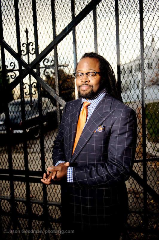
The coat is very Windsor and I like it. The tie works and (since it is orange) I could work with it. The shirt's large pattern and color however are distracting us from the other two elements. Think of a way to create interest with a shirt pattern and color that augments and underlines the goodness in the other elements. You do not have to go to the soft sky blue plain shirt if you want something more dandified. But think of a small herringbone, a stripe or small houndstooth.
Cheers
Michael
-
ay329
- Posts: 505
- Joined: Tue Aug 07, 2007 3:54 pm
-
Contact:
Mon Aug 30, 2010 6:53 am
I feel a more subtle windowpane pattern would work even better (and pray the follow up blue Agnelli is more understated than this)
I liked the shirt and was surprised at how well the wearer incorporated the orange tie with his checked/windowpane shirt and suit.
The peak lapels were a nice touch
I would only add...as much as I like the shirt, with myself, when wearing windowpane suits...due to the complexity of their patterns, perhaps a solid color shirt is more appropriate
Last edited by
ay329 on Tue Aug 31, 2010 3:23 am, edited 1 time in total.
-
J.S. Groot
- Posts: 344
- Joined: Mon Mar 08, 2010 9:33 am
-
Contact:
Mon Aug 30, 2010 7:43 am
Is it just my eyes or does the windowpane not line up correctly with the sleeve?
I would have preferred the coat with a windowpane that was a tad more subtle and sans peaks. I think the combination of the powerful pattern and the powerful lapels is, well, overpowering. Same goes for the shirt, which I quite like, but not with the rest of the ensemble. If only one element could be changed, it'd be the shirt, and that into one of a more subtle patterning as Alden suggests. Also, I don't think the wide spread collar is particularly flattering on you. The tie works well, however, I'd prefer it in grenadine instead of plain satin. The shine of it adds further power to the combination. Finally, I think the pocket square looks studied. The orange is too close to the colour of the tie.
-
Users browsing this forum: No registered users and 6 guests

